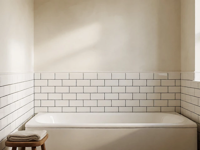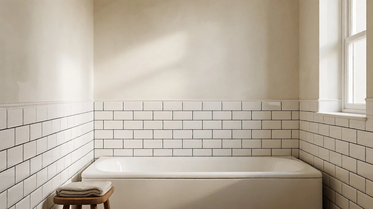
Timeless Bathroom Color Simulator
Select a recommended timeless color and simulate how it appears under different lighting scenarios. This helps you avoid common mistakes like choosing grays that look too cold or whites that feel sterile.
Analysis & Advice
This color looks crisp and clean under natural daylight. It reflects light well, making the space feel larger. Pair with brass or wood accents for warmth.
Why this choice?
- High resale value due to neutrality.
- Works with almost any fixture material.
- Low maintenance visually.
You walk into a hotel bathroom in London or a boutique stay in New York, and something feels right. It’s not flashy. It doesn’t scream for attention. Yet, you remember it ten years later. That feeling usually comes down to one thing: the color. Choosing a timeless bathroom color isn’t about chasing what’s popular on Pinterest this week. It’s about picking shades that survive changing tastes, resale pressures, and your own evolving style. If you’re tired of repainting every few years because the current trend suddenly looks dated, you need colors with staying power.
Why does this matter? Because bathrooms are expensive to renovate. Tiling, fixtures, and plumbing don’t change often. If you pick a bold teal tile now, you might hate it by 2030. But if you choose a foundation of white, gray, or soft beige, you can swap out accessories and towels to refresh the look without tearing anything out. This guide breaks down exactly which colors hold up over decades, why they work, and how to use them so your space never feels stale.
The Psychology Behind Enduring Shades
Color psychology plays a huge role in longevity. We tend to reject colors that trigger high anxiety or feel overly stimulating when we want to relax. Bathrooms are sanctuaries. You start your day there and end it there. High-energy colors like bright red or electric blue demand attention. They raise your heart rate. Over time, that becomes exhausting. In contrast, low-saturation colors-those mixed with gray or white-calm the nervous system. They recede visually, making small spaces feel larger and cleaner.
Think about nature. The most restful environments aren’t neon. They’re foggy mornings, sandy beaches, stone cliffs, and deep forests. These natural palettes are inherently balanced. When you bring these tones indoors, you tap into a biological preference for safety and calm. This is why earthy neutrals and soft blues remain relevant across centuries. They don’t fight against human instinct; they support it. If a color makes you feel grounded rather than jittery, it has a higher chance of remaining timeless.
Top Contenders for Timeless Bathroom Colors
Not all neutrals are created equal. Some yellows turn dingy. Some grays look cold and industrial. Here are the specific shades that designers consistently recommend for long-term appeal.
| Color Family | Best For | Lighting Needs | Accessory Pairings | Risk Factor |
|---|---|---|---|---|
| Warm White | Small rooms, dark corners | Works in any light | Brass, wood, black accents | Can look clinical if too stark |
| Soft Gray | Modern, minimalist spaces | Needs warm artificial light | Chrome, marble, navy | Can feel cold in north-facing rooms |
| Sage Green | Spa-like atmospheres | Natural daylight preferred | Rattan, linen, copper | Trend-sensitive if too vibrant |
| Navy Blue | Statement walls, powder rooms | High contrast lighting | Gold, white, brass | Makes small rooms feel smaller |
| Greige | Universal appeal, resale value | Flexible | Any metal finish | Can appear muddy if undertones clash |
Warm White is the safest bet. Unlike pure optical white, which reflects 100% of light and can cause glare, warm white has yellow or beige undertones. This mimics sunlight. It makes porcelain tubs and tiles look pristine rather than sterile. If you have limited natural light, this color bounces what little you have around the room effectively.
Soft Gray offers a modern edge without the harshness of charcoal. Look for greys with green or brown undertones (often called "greige"). Avoid blue-based grays unless you have abundant warm lighting, as they can make a bathroom feel like a hospital corridor in winter. Soft gray pairs beautifully with white subway tiles, creating a crisp, clean aesthetic that has dominated high-end designs for twenty years.
Sage Green bridges the gap between neutral and colorful. It’s muted enough to act as a background but distinct enough to add character. This shade connects the indoor space to the outdoors, promoting a spa-like vibe. It works exceptionally well with natural materials like bamboo shelves or teak stools. However, keep the saturation low. A bright lime green is trendy; a dusty sage is timeless.
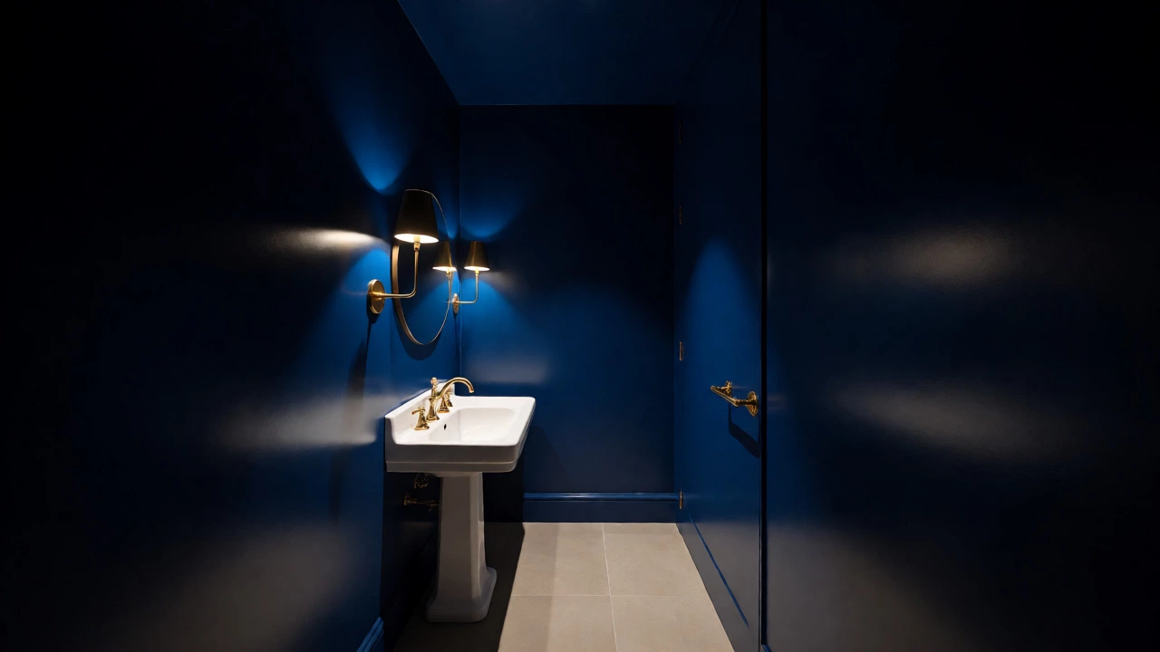
Navy Blue serves as a near-neutral in design circles. It provides depth and drama without the heaviness of black. Navy works best on accent walls or cabinetry rather than entire rooms, especially in smaller bathrooms. It creates a sophisticated backdrop for gold or brass hardware, adding a touch of luxury that ages gracefully.
How Lighting Changes Everything
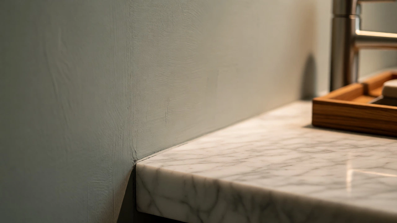
You picked a beautiful swatch at the store. It looked perfect under fluorescent lights. Then you get it home, and it looks nothing alike. This happens because color is relative to light temperature. Daylight bulbs (5000K+) show true colors but can be harsh. Warm bulbs (2700K-3000K) cast a yellow glow, shifting whites toward cream and grays toward taupe.
Before committing to a gallon of paint, buy sample pots. Paint large patches on different walls-one facing north, one facing south. Observe them at three times: morning, noon, and night with artificial lights on. If you live in Auckland or other southern hemisphere locations, note that south-facing rooms get intense direct sun, which can bleach out pale colors faster. North-facing rooms stay cool and dim, requiring warmer paint tones to counteract the blue shadow effect.
Consider your fixtures too. If you have old pink or almond-colored tiles from the 1980s, trying to force a cool gray wall will create a visual clash. Instead, lean into warm neutrals like beige or creamy white. These harmonize with the existing warmth of the tiles, creating a cohesive look rather than fighting against it.
Material Pairings That Enhance Longevity
Paint doesn’t exist in a vacuum. It interacts with tiles, countertops, and metals. To ensure your color choice remains timeless, pair it with materials that also have historical staying power.
- Marble and Stone: Carrara marble has been used for centuries. Its veining adds organic interest that prevents flat paint colors from looking boring. Even faux-marble vinyls today mimic this classic look.
- Wood Accents: Teak, oak, and walnut introduce warmth. Wood grain changes subtly over time, patinaing rather than degrading. This natural aging process complements neutral walls perfectly.
- Brushed Metals: Polished chrome is durable but reflective. Brushed nickel and matte black offer softer reflections that hide fingerprints and water spots. Brass is trending now, but its antique roots make it likely to cycle back into favor repeatedly.
- Glass Elements: Clear glass shower doors maintain sightlines and prevent the room from feeling boxed in. Frosted glass adds privacy while diffusing light, enhancing the mood set by your wall color.
Avoid pairing highly specific trendy materials with your paint. For example, terrazzo is fun, but if you combine it with a very specific millennial pink, you lock yourself into a 2016 aesthetic. Stick to classic material combinations-white tile with black grout, wood vanity with white top-and let the paint color do the heavy lifting for atmosphere.
Common Mistakes That Date a Bathroom
Even within timeless palettes, execution errors can ruin the effect. The biggest mistake is using too many contrasting colors. A bathroom should feel unified. If your walls are gray, floor is beige, vanity is white, and towel rack is gold, you have four competing focal points. Pick two dominant tones and one accent. Maybe gray walls, white fixtures, and gold hardware. Simple.
Another trap is ignoring undertones. Many people pick a "gray" paint that actually has purple undertones. Under certain lights, this clashes with blue tiles or green plants, creating an unsettling vibration. Always test samples next to your fixed elements (tiles, tub) before deciding.
Finally, don’t forget the ceiling. Painting the ceiling the same color as the walls (or slightly lighter) removes the hard line where wall meets roof. This trick, known as "color drenching," makes small bathrooms feel infinite. It’s a technique used in historic homes and contemporary spas alike because it works.
Practical Steps for Your Renovation
Ready to update your space? Follow this checklist to ensure your new color scheme stands the test of time.
- Audit Fixed Elements: List everything you won’t replace (tiles, tub, sink). Note their exact colors and finishes.
- Select a Base Neutral: Choose a warm white, greige, or soft gray that complements your fixed elements.
- Pick One Accent Color: Decide if you want depth (navy), nature (sage), or brightness (pastel yellow). Limit this to one area, like a cabinet door or half-wall.
- Test Samples: Apply large patches. Live with them for 48 hours.
- Choose Hardware Second: Let the paint dictate the metal finish. Cool paints suit chrome/nickel; warm paints suit brass/gold.
- Add Textiles Last: Towels and rugs are cheap swaps. Use them to inject temporary trends without painting again.
This method keeps your core investment safe while allowing flexibility. You can change your rug from bohemian to minimalist without touching a brush. That adaptability is the secret to true timelessness.
Is white really the most timeless bathroom color?
Yes, specifically warm whites. Pure bright white can look sterile and show dirt easily, but off-whites with subtle yellow or gray undertones reflect light well, match almost any accessory, and never go out of style. They serve as a blank canvas that allows other design elements to shine.
Should I avoid dark colors in small bathrooms?
Not necessarily. Dark colors like navy or charcoal can make a small bathroom feel cozy and intimate rather than cramped, provided there is sufficient lighting. However, they require careful planning. Ensure you have adequate artificial lighting and consider using dark colors only on accent walls or lower halves of the wall to maintain an airy feel above eye level.
How do I choose a paint color if I have colored tiles?
Identify the undertone of your tiles (warm or cool) and select a paint color with the same undertone family. If you have beige or peach tiles, stick to warm creams and taupes. If you have blue or gray tiles, opt for cool whites and grays. Never mix warm and cool undertones unless you intentionally want a high-contrast, eclectic look.
Are gray bathrooms still stylish in 2026?
Gray remains stylish when chosen correctly. The key is avoiding cold, blue-based grays that dominate early 2010s designs. Modern timeless grays lean warmer, incorporating beige or green undertones (greige). These softer grays pair well with the current resurgence of natural materials and warm metallics, keeping the look fresh yet enduring.
What is the best color for resale value?
Neutral palettes sell best. Warm whites, light grays, and soft beiges appeal to the widest range of buyers. Bold colors limit your audience because potential buyers may dislike them and factor in repainting costs. Sticking to versatile neutrals ensures your bathroom looks clean, spacious, and move-in ready for anyone.