Relaxing Bathroom Color Finder
Find Your Perfect Calming Color
Answer a few questions to get personalized recommendations for your relaxing bathroom color.
Choosing the right hue can turn a plain bathroom into a personal sanctuary. If you want the ultimate relaxing bathroom color, you need to understand how shades affect mood, how light interacts with paint, and which finishes keep the vibe soft.
Why Color Matters in a Bathroom
A bathroom’s size, fixtures, and natural light already set a tone. Adding the right color amplifies that feeling, making cramped spaces feel airy or bright areas feel cozy. Research in environmental psychology shows that color influences heart rate, perceived temperature, and stress levels.
When you paint with a relaxing bathroom color a hue that promotes calmness and reduces stress in a bathroom setting, you’re essentially designing an atmosphere that supports daily routines, from a quick shave to a long soak.
How Color Psychology Works
Color psychology examines the emotional response triggered by different wavelengths of light. Warm tones (reds, oranges) tend to energize, while cool tones (blues, greens) calm the nervous system. Neutral palettes act as a soothing backdrop, allowing accessories and textures to shine without overwhelming the senses.
In the context of color psychology the study of how colors influence human behavior and emotions, bathrooms benefit most from cool and muted shades because they counteract the often stark, utilitarian feel of tiles and fixtures.
Top Relaxing Colors for Your Bathroom
Below are the five hues that consistently rank highest for calmness, based on surveys from interior designers and psychological studies.
- Soft gray a gentle, neutral shade that mimics natural stone
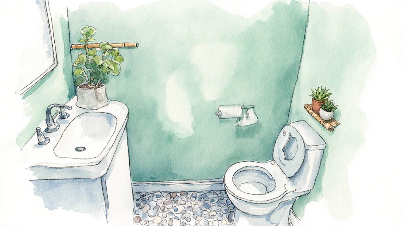
- Seafoam green a muted green with a hint of blue that evokes ocean breezes
- Powder blue a light, pastel blue that encourages relaxation
- Warm neutral a beige‑taupe blend that adds coziness without warmth overload
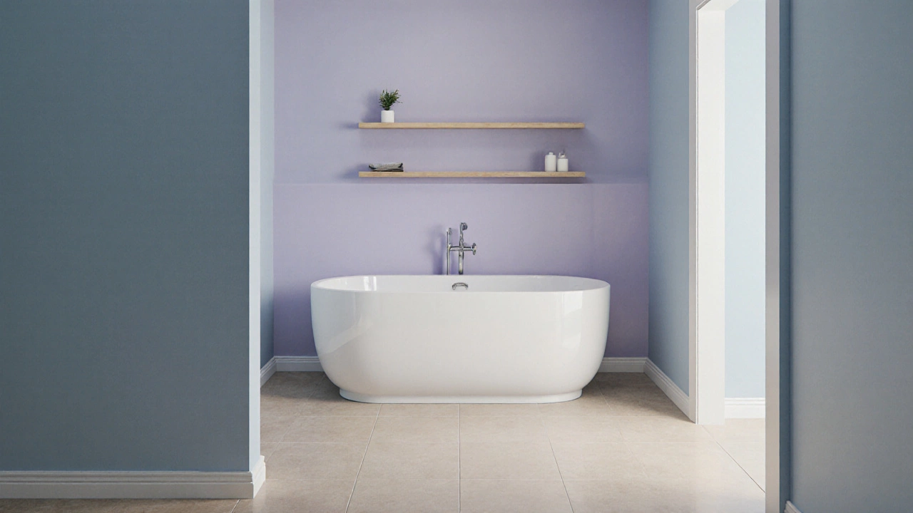
- Lavender mist a faint purple that balances calmness with a touch of luxury
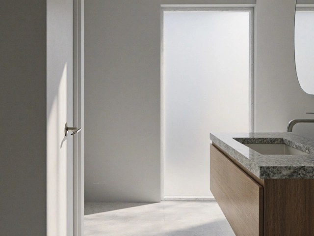
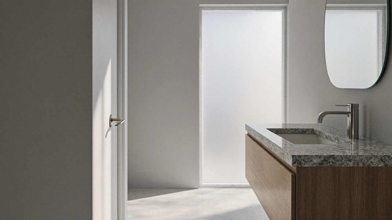
Soft Gray
Soft gray works well in bathrooms with ample natural light because the shade reflects light without creating glare. Pair it with matte or eggshell finishes to avoid a glossy, sterile look. Gray also complements wood accents, bringing a spa‑like feel.
Seafoam Green
Seafoam green is perfect for coastal‑themed spaces. Its subtle blue undertone mirrors water, which instinctively reduces stress. Matte satin finishes keep the surface smooth and hide water spots.
Powder Blue
Powder blue creates a breezy atmosphere, especially in small bathrooms where bright colors can feel oppressive. Use a semi‑gloss finish on trim to add a hint of elegance while keeping walls matte for softness.
Warm Neutral
Warm neutrals such as beige‑taupe blend with most tile colors, helping to unify the space. They work best with warm LED lighting that mimics sunrise tones. A low‑sheen finish prevents the wall from feeling too flat.
Lavender Mist
Lavender adds a subtle luxury without being overpowering. It pairs nicely with white fixtures and brushed nickel hardware. Choose a flat finish to maintain a calm visual texture.
Matching Colors with Lighting and Finishes
Light dramatically alters how a color is perceived. The same paint can look bright and airy in a sun‑lit room but flat in a windowless space.
Natural light sunlight entering through windows or skylights enhances cool hues, making them appear fresher. If your bathroom lacks windows, opt for warm LED bulbs (2700‑3000K) that soften cool tones.
Choosing the right paint finish the surface sheen of painted walls, ranging from matte to high‑gloss is also crucial. Matte finishes absorb light, reducing glare and emphasizing texture-ideal for calming environments. Satin or low‑sheen finishes are more durable for high‑traffic bathrooms while still maintaining a soft appearance.
Creating a Cohesive, Soothing Palette
Beyond the main wall color, accessories, towels, and flooring should echo the calming theme.
- Select rugs or bath mats in complementary muted tones (e.g., soft ivory with a gray wall).
- Use glass or frosted mirrors to reflect light without adding visual clutter.
- Incorporate natural elements like potted plants or wooden shelves to reinforce the serene vibe.
- Limit high‑contrast patterns; instead, choose subtle textures such as linen towels or woven baskets.
When every element follows a subdued color story, the bathroom feels like a retreat rather than a functional room.
Common Pitfalls and Pro Tips
- Over‑saturation: Even a relaxing hue can become overwhelming if used on all surfaces. Keep ceilings and trim neutral.
- Ignoring moisture: Choose paints labeled “mildew‑resistant.” This maintains color integrity over time.
- Bad lighting combos: Pairing cool walls with harsh cool LEDs creates a clinical feel. Balance with warm accent lights.
- Skipping test patches: Paint a 12‑inch square on two walls (one near a window, one away). Observe at different times of day.
Following these tips helps you avoid costly redo’s and ensures the space stays relaxing for years.
Quick Checklist for a Calming Bathroom
- Pick a primary relaxing hue (soft gray, seafoam green, powder blue, warm neutral, or lavender mist).
- Choose a matte or low‑sheen paint finish.
- Match lighting: natural light + warm LED bulbs (2700‑3000K).
- Use moisture‑resistant, mildew‑proof paint.
- Complement with neutral accessories and natural textures.
- Test paint patches at different times before committing.
Frequently Asked Questions
Which color makes a small bathroom feel larger?
Light pastel shades like powder blue or soft gray reflect more light, creating an illusion of space. Pair them with matte finishes to avoid glare.
Can I use a bold color and still keep the room relaxing?
Yes, if you limit the bold hue to an accent wall or accessories and keep the remaining surfaces neutral. This adds personality without overstimulating the senses.
Do I need a special paint for bathrooms?
Choose a paint labeled “bathroom” or “kitchen & bath” - it contains mildew‑resistant additives and can handle humidity better than regular interior paint.
How does lighting affect paint color?
Cool light (blue‑white) can make colors appear more subdued, while warm light (yellow‑white) adds richness. Match lighting temperature to your chosen hue for the intended mood.
Is it okay to paint over old tile?
Only if the tile surface is smooth, clean, and primed. Use a bonding primer and a high‑quality bathroom paint; otherwise, consider tiling over or removing the old tiles.
Comparison of Top Relaxing Bathroom Colors
| Color | Psychological Effect | Best Lighting | Recommended Finish |
|---|---|---|---|
| Soft Gray | Neutral calm, reduces visual clutter | Natural light or warm LED (3000K) | Matte or low‑sheen |
| Seafoam Green | Refreshes, mimics water, lowers stress | Bright natural light | Matte satin |
| Powder Blue | Soothing, promotes tranquility | Soft warm LED (2700‑3000K) | Semi‑gloss on trim, matte walls |
| Warm Neutral | Cozy, inviting without overstimulation | Warm LED or daylight | Low‑sheen |
| Lavender Mist | Elegant calm, subtle luxury | Dimmed warm lighting | Flat or matte |