Elegant Room Color Selector
Select a color and room type, then click "Discover Elegance" to see personalized suggestions.
Elegant Color Guide
Navy Blue
Calm & authoritative
Charcoal Gray
Modern & grounded
Emerald Green
Refreshing & regal
Deep Plum
Romantic & sophisticated
Soft Taupe
Calm & adaptable
Key Takeaways
- Deep, muted hues such as navy blue, charcoal gray, and emerald green create instant elegance.
- Pair rich base colors with metallic accents or soft neutrals for balance.
- Consider room function, natural light, and existing furnishings when selecting a shade.
- Use the quick checklist at the end to avoid common style mistakes.
When you walk into a room painted the right color, it feels more polished, more inviting, and, yes, more elegant. The challenge is that “elegant” can mean many things-some people picture a sleek black‑and‑white palette, while others think of warm, muted tones. This guide cuts through the confusion and shows you exactly which colors consistently deliver that high‑end look, how to pair them, and what pitfalls to dodge.
Elegant room color is a paint shade or finish that conveys sophistication, timelessness, and a sense of curated style. It works by balancing depth with light, and by harmonizing with furnishings, textures, and lighting. Below, we break down the most reliable options and the logic behind each.
Understanding What Makes a Color Feel Elegant
Elegance in interior design isn’t just about dark versus light; it’s about intentional contrast, richness, and cohesion. A color that feels elegant typically meets three criteria:
- Depth: Deep, saturated tones absorb light, adding a sense of weight and permanence.
- Neutral Harmony: Elegant colors often sit near the neutral spectrum, allowing accessories and furniture to shine without clashing.
- Timelessness: Trends come and go, but hues like navy, charcoal, and emerald have endured in classic design archives.
Knowing these principles lets you evaluate any shade beyond gut feeling.
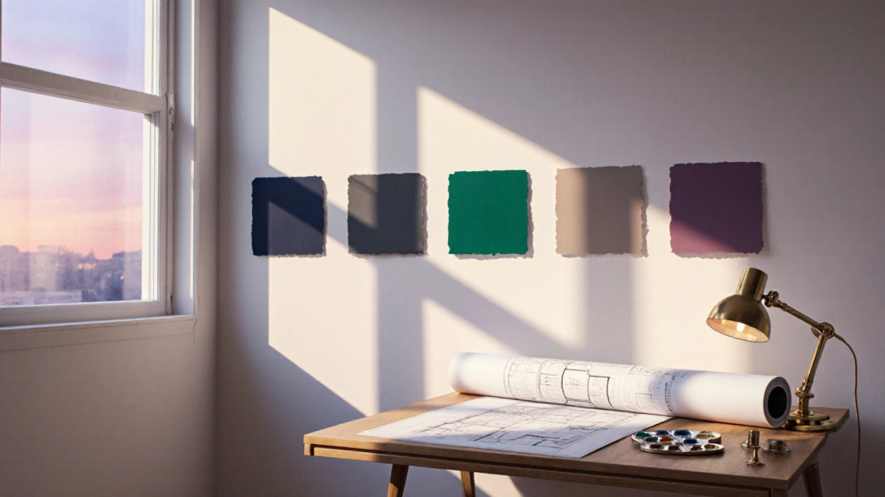
Top Sophisticated Shades
Below are the six most reliable hues that consistently make rooms look elegant. Each entry includes the color’s psychological impact, ideal rooms, and pairing suggestions.
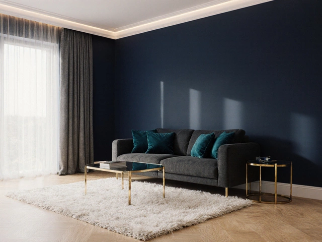
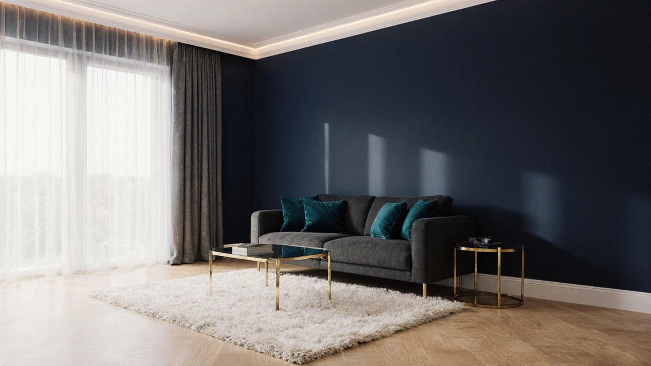
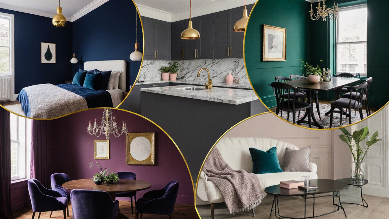
Navy Blue
Deep navy is the ultimate “luxury backdrop.” It exudes confidence without feeling oppressive.
- Mood: Calm, authoritative, and slightly nautical.
- Best for: Living rooms, master bedrooms, and home offices where you want focus.
- Pairing: Gold or brass hardware, crisp white trim, and natural wood tones.
Because navy absorbs light, it looks especially elegant in rooms with ample windows or layered lighting.
Charcoal Gray
A sophisticated alternative to black, charcoal gray offers depth while staying versatile.
- Mood: Modern, grounded, and refined.
- Best for: Bathrooms, kitchens, and contemporary loft spaces.
- Pairing: Marble countertops, copper fixtures, and soft pastel accents.
When paired with high‑gloss finishes, charcoal walls can mimic the look of upscale hotel corridors.
Emerald Green
Emerald brings a touch of nature’s richness indoors while staying unmistakably regal.
- Mood: Refreshing, opulent, and slightly exotic.
- Best for: Dining rooms, entryways, and boutique‑style studies.
- Pairing: Brass lighting, velvet upholstery, and dark wood furniture.
Its jewel‑tone quality works beautifully with natural light, making the space feel both airy and plush.
Deep Plum
Plum offers a moody, yet warm backdrop that feels unexpectedly inviting.
- Mood: Romantic, sophisticated, and slightly dramatic.
- Best for: Private bedrooms, reading nooks, and intimate lounges.
- Pairing: Soft gold accents, muted teal, and plush indigo textiles.
The subtle red undertones give the room a sense of depth without overwhelming the senses.
Soft Taupe
For those who prefer lighter neutrals, soft taupe provides understated elegance.
- Mood: Calm, inviting, and universally adaptable.
- Best for: Open‑plan living areas, kitchens, and hallways.
- Pairing: Dark wood floors, ivory furnishings, and matte black hardware.
Because taupe is a warm gray, it works well with both cool and warm accent colors.
Metallic Gold Accents
While not a wall color, gold finishes on trim, light fixtures, or decorative hardware instantly lift any hue to a luxe level.
- Effect: Adds glimmer, reflects light, and signals wealth.
- Best Uses: Crown molding on navy walls, cabinet pulls in charcoal kitchens, and picture frames in emerald rooms.
- Tip: Keep gold elements modest-too much can feel gaudy.
How to Choose the Right Shade for Your Room
Follow this decision framework to match a color to your space’s unique constraints.
- Assess Natural Light: Bright rooms can handle darker tones like navy or charcoal. Dim rooms benefit from slightly lighter shades such as soft taupe.
- Identify Room Function: Restful spaces (bedrooms) often favor muted colors (deep plum, taupe), while entertaining areas (dining) can handle richer hues (emerald).
- Consider Existing Furnishings: Look at your sofa fabrics, wood finishes, and floor coverings. Choose a wall color that complements rather than competes.
- Test Samples: Paint 4‑inch squares on opposite walls; observe them at sunrise, noon, and dusk.
- Plan Accent Strategy: Decide early if you’ll use gold hardware, patterned rugs, or artwork to balance the base color.
Pairing Tips: From Accents to Lighting
Even the most elegant hue can look flat without thoughtful accompaniment.
- Metallic Finishes: Brass, gold, or brushed nickel add reflective depth.
- Textile Contrast: Velvet cushions in muted teal pair beautifully with deep plum walls.
- Artwork: Large‑scale abstract pieces that echo the wall hue’s undertone create harmony.
- Lighting: Use warm‑white LEDs (2700‑3000K) in rooms with cool dark tones to soften the atmosphere.
Common Mistakes to Avoid
- Over‑saturating a Small Space: A 10‑ft bedroom painted charcoal can feel cramped. Mix in light flooring or ceiling paint.
- Ignoring Undertones: Navy with a purple undertone clashes with true blue accessories; stick to a clear undertone chart.
- Neglecting Finish: Matte finishes absorb light and hide imperfections but can appear flat in low‑light rooms. Semi‑gloss adds subtle bounce.
- Too Many Accent Colors: One or two complementary accents keep the elegant vibe intact.
Quick Elegance Checklist
- ✔ Choose a deep, timeless hue (navy, charcoal, emerald, plum, taupe).
- ✔ Test paint samples in all lighting conditions.
- ✔ Pair with metallic hardware or subtle gold accents.
- ✔ Balance with neutral furniture or textiles.
- ✔ Keep the finish appropriate to room light (semi‑gloss for low light, matte for bright rooms).
| Color | Typical Mood | Best‑Fit Rooms | Ideal Pairings |
|---|---|---|---|
| Navy Blue | Calm & authoritative | Living room, bedroom, office | Gold accents, white trim, wood |
| Charcoal Gray | Modern & grounded | Bathroom, kitchen, loft | Marble, copper, pastel accents |
| Emerald Green | Refreshing & regal | Dining, entryway, study | Brass, velvet, dark wood |
| Deep Plum | Romantic & sophisticated | Bedroom, lounge, nook | Gold, teal, indigo textiles |
| Soft Taupe | Calm & adaptable | Open‑plan, kitchen, hallway | Dark wood, ivory, matte black |
Frequently Asked Questions
Can I use an elegant color on a ceiling?
Yes, but keep it light. A muted taupe or very soft navy on the ceiling can add depth without making the space feel lower. Pair with brighter walls to maintain balance.
How much paint will I need for a dark color?
Dark pigments require slightly more coats. A 350‑sq‑ft room typically needs 2-3 gallons for two coats, depending on surface texture.
Is glossy finish suitable for elegant walls?
Semi‑gloss works well in low‑light rooms because it reflects some light, while matte is better for bright rooms where you want a soft, muted look.
Should I match my flooring to the wall color?
Contrast creates elegance. Dark walls with light hardwood or a neutral carpet provide visual relief and keep the room from feeling heavy.
Can I combine two elegant colors in one room?
Absolutely. Use one as the dominant wall hue and the other for an accent wall or trim. For example, navy base with a charcoal accent creates a sophisticated layered effect.