When it comes to decorating your home, the 60-30-10 rule is a vital principle every interior designer swears by. It's one of those secrets that once revealed, you’ll wonder how you ever managed without it. The beauty of this rule lies in its simplicity, making decorating attainable and enjoyable for everyone.
In this article, we’ll dive into applying the 60-30-10 rule specifically with cushions. They are the unsung heroes of home decor, offering both comfort and style and transforming an ordinary room into a cozy sanctuary. Whether you’ve just moved into a new home or you're simply refreshing your existing space, knowing how to balance colors and textures with cushions can make all the difference.
- Understanding the 60-30-10 Rule
- Applying the Rule to Cushions
- Choosing the Right Colors
- Incorporating Textures and Patterns
- Balancing Functionality and Style
- Mistakes to Avoid in Cushion Decor
Understanding the 60-30-10 Rule
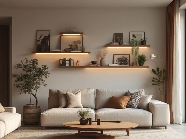
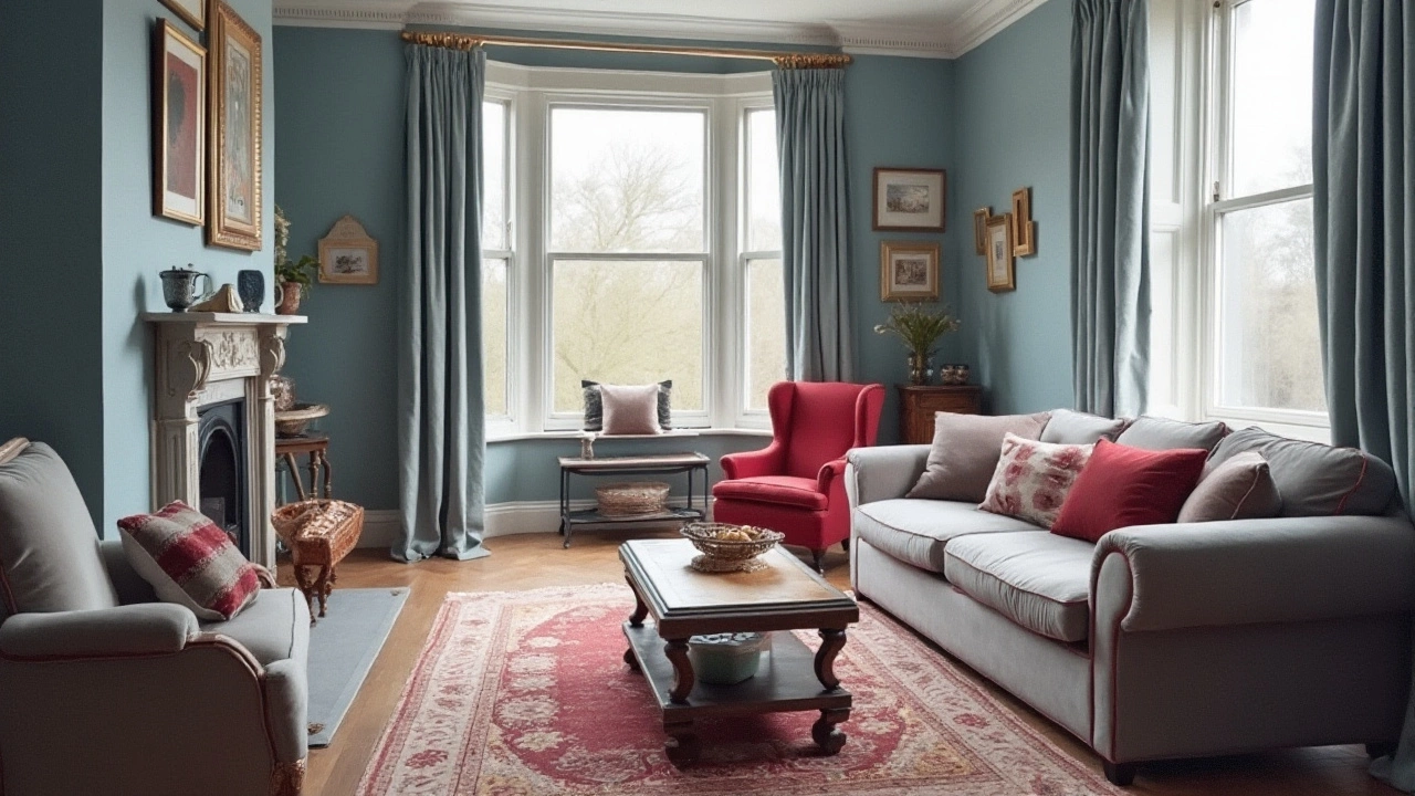
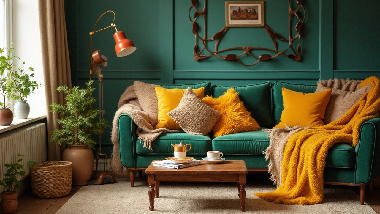
The 60-30-10 rule is more than just a guideline; it's a palette symphony that orchestrates your space's harmony. Picture walking into a room that feels just right — cozy, inviting yet not overwhelming. This effect doesn't happen by chance. The 60-30-10 rule is the trick that many designers use to balance color and create a room that feels both cohesive and exciting. So, what does it really mean? This rule divides colors in a space into three unequal categories: dominant, secondary, and accent. The dominant color takes up 60% of the room, offering the foundation and defining the mood. The secondary color commands 30%, adding depth and complexity, while the remaining 10% comes in as a pop of excitement. This technique is used to avoid color overload and to meticulously guide the eye across the room.
The most thrilling part of this decorating strategy is its versatility. You can apply it to any room, adorn it with any style, and yet the rules remain the same. The dominant 60% typically covers walls, large accent pieces, or flooring. This is the anchor that dictates the overarching theme, whether you choose soft neutrals for a calming space or deep tones for dramatic flair. The 30% serves to support and bolster the dominant shade; this could include upholstered furniture, curtains, or rugs. Finally, the delightful 10% — like icing on a cake — constitutes smaller items like art pieces, decorative items, and of course, cushions. These pops are not merely afterthoughts but are strategic strokes that bring a room to life.
Cushions play an integral role here because they provide an effortless and inexpensive way to swap out your accents in accordance with trends or seasonal preferences. What’s truly mesmerizing is how this rule supports spontaneity within the boundaries of discipline. Can you imagine how achieving such professional-looking spaces could be within your reach? It's not just about color. When the decorating tips spotlight cushions, you see the connection between form and function. The color balance ensures that your interiors are not only easy on the eyes but also on the mind, offering a sanctuary, a shield against the chaos outside.
In case you're doubting the efficacy of this method, take a cue from the words of world-renowned interior decorator Nate Berkus. He says, "A room should feel collected, not decorated."
Nate Berkus: "A room should feel collected, not decorated."It's a sentiment that resonates, right? The 60-30-10 rule embodies this idea by allowing you to artfully collect colors and textures without risking a cluttered vibe. It’s like having a foolproof recipe for stylish living, one that turns each room into your personal masterpiece without demanding an artist's touch. It enables creativity with guidelines, making it a designer's secret weapon.
Applying the Rule to Cushions
Decorating with cushions can feel overwhelming with the variety of options available, but the 60-30-10 rule simplifies this task into a more delightful experience. At its core, this rule suggests a ratio of three colors: main, secondary, and accent. Within a room, the main color should account for 60% of the decor, the secondary takes up 30%, and the accent color should surprise and delight by making up the remaining 10%. When applied to cushions, this rule helps achieve a sense of harmony and visual balance.
To start applying this rule with cushions, identify the room's main color, often reflected in the walls, large furniture, or a rug. This color extends to 60% of your space, so choose a set of cushions in this dominant color. They anchor the room, acting like a foundation layer upon which all other hues rest comfortably. Often, people overlook how impactful cushions matching drapery can unify the space elegantly.
Next, for the 30%, select a secondary color that complements the main color while adding depth. This is where the magic begins. Choose cushions slightly darker or lighter than the main color to create layers and dimensions. This secondary color often comes from artworks, curtains, or secondary furniture. It plays a supportive role, bridging the main and accent colors seamlessly. Danielle Colding, a renowned designer, suggests,
"Your secondary hues should whisper more than shout, allowing the eyes to rest."
Now, let’s talk about the playful 10%. The accent color should be bold, providing a splash of interest and a touch of surprise. It’s the chance to really show personality. Consider textures, sequins, or patterns within this hue, perhaps drawing inspiration from a beloved painting or accessory in the room. This could be a single bold silk cushion that stands out or a collection with unique trims around the edges. It often reflects a homeowner's personality, making the space truly theirs.
Triadic color schemes frequently work splendidly with cushions, tapping into a tri-color harmony that has existed since Renaissance art. You can achieve visual storytelling by selecting hues equidistant on the color wheel, achieving not just balance but also intrigue. Additionally, a nice way to enhance a space is by stitching in florals or geometric designs. These elements can elevate your decor by drawing eyes and pulling the entire room together.
For those who like experimenting, texture becomes the unexpected element. Mixing silk, velvet, and wool in cushions can add tactile pleasure, inviting guests to interact with the decor. Textures can also reflect the seasons; for warmth in winter, materials like faux fur prevail, while cotton and linen keep things fresh in summer.
If precision appeals to you, a table or a balanced tally can define cushion counts and arrangements in various room setups:
| Room Size | Main Cushions (60%) | Secondary Cushions (30%) | Accent Cushions (10%) |
|---|---|---|---|
| Small | 3 | 2 | 1 |
| Medium | 5 | 3 | 2 |
| Large | 7 | 4 | 3 |
In the end, applying the 60-30-10 rule to cushion arrangement is about balancing creativity with structure. This doesn't just culminate in a visually pleasing environment but also ensures a comfortable, welcoming haven for family and guests alike.
Choosing the Right Colors
When it comes to home decor, the significance of choosing the right colors for your cushions cannot be overstated. This choice sets the tone for the entire space, impacting mood and enhancing visual appeal. The 60-30-10 rule is your guiding light here, suggesting a color balance that is both harmonious and engaging. Begin with a dominant color that consumes 60% of the visual palette. This can be the color of your walls, large pieces of furniture, or floor coverings. The key idea is to choose a color that serves as a tranquil backdrop for your cushions to pop against, establishing a sense of unity and flow across the room.
Next, delve into selecting a secondary color which occupies 30% of the space. Often, the tissue woven into the second largest piece of furniture or a prominent decorative piece can guide you toward this hue. This color can be a little bolder, but it should complement the dominant one. It serves to create layers within the visual design, providing a space for your eyes to rest. This color can seamlessly tie in with the curtains, secondary furniture, or even an impactful piece of artwork. A well-chosen secondary color adds the depth needed to make your cushion arrangement truly stunning.
Completing the palette, the 10% accent color is where your decorating tips expertise shines. This is where cushion arrangement truly gets exciting, as this color can bring vibrancy and life into the room. It's the perfect opportunity to introduce unexpected hues through cushions that draw the eye and make a statement. Opt for rich, bold options that either contrast or intricately complement the other two colors. This could be through silky textured covers, playful geometric patterns, or even an adventurous pop of color like teal, mustard yellow, or emerald green—any of which can transform the mundane to the marvelous.
As you explore color choices, it’s essential to consider natural light and how it interacts with fabrics imbued with these color choices. According to design expert Abigail Ahern, "Understanding light, both natural and artificial, greatly helps in achieving the perfect ambiance—crushing the myth that dark colors make a space smaller." Your choice needs to work with the lighting condition of the room since different times of the day can bring out different shades in the same material.
Another factor to consider is the aesthetic feeling you’re aiming to bring into your space. Warm tones like reds and oranges are known for evoking feelings of comfort and energy, while cool tones like blues and greens are typically calming and serene. Cushions in neutral colors, often understated and versatile, can deliver a chic and sophisticated feel. A common misconception is that neutrals mean bland decor when, in fact, they can act as the ideal canvas for layering different textures. Understanding the emotional impact of color empowers you to manipulate space in accordance with your needs.
Incorporating Textures and Patterns
In the world of interior design, each element tells a story and when it comes to cushions, textures and patterns can speak volumes. The right texture and pattern complement each other, creating a visual dialogue within the space. Imagine a living room where each cushion is a stroke of art, playing harmony with the other elements. Start by embracing the rich tapestry of materials at your disposal—from velvet's opulent allure to the rustic charm of linen. Each fabric lends its unique voice to the decor.
Mixing textures is an art that can elevate your home decor from mundane to magnificent. Layering with various materials—like pairing a smooth silk cushion with a rough-hewn woven one—can add dimension and depth. Choosing the right mix involves understanding the feeling you want your space to evoke. Textures add tactile interest, which can be crucial in a room that might otherwise feel flat. Not only do these elements provide visual interest, but they also enhance the cozy, inviting vibe of the room.
Patterns That Speak
When it comes to patterns, start with a bold pattern as your main attraction and then choose others in secondary patterns that complement rather than compete. The scale of these patterns matters as well; too many big bold patterns can overpower the room. Instead, allow smaller patterns to accentuate and frame the larger motifs. A balanced collection might include a floral pattern, a geometric shape, and a solid color to round it out. Remember, the primary purpose is to let cushions highlight your space, not clutter it.
"Design is not just what it looks like and feels like. Design is how it works." - Steve Jobs
Patterns can function as subtle boundaries within a room without the need for physical barriers. They can define spaces in an open plan while also adding an artistic flair. Consider incorporating cushion arrangement techniques to optimize these elements, placing patterned pillows at peak points to draw the eye where you wish it to wander.
Balancing Colors and Patterns
Once you have your textures and patterns lined up, it’s time to think about how they play with color. Neutral tones can make your room feel spacious, while a splash of color from a bold cushion can act as a statement piece. Your selection of colors should highlight the patterns you've chosen and complement the existing scheme in your space. Playing with contrasts can draw attention, but subtle shifts in shades can create more soothing transitions. Dive into color psychology and understand how different colors can affect mood and perception within a room.
Be mindful of blending these elements with the rest of your home decor. Patterns and textures are visual anchors, pulling the audience into a curated experience. Each cushion you choose should contribute to the overall narrative you’re telling in your space, one that feels both intentional and effortlessly stylish. Engage your creativity and don't be afraid to experiment until you find the perfect balance.
Balancing Functionality and Style
Creating a harmonious blend of functionality and style in home decor, especially when it comes to cushions, demands a thoughtful approach. Cushions aren't merely decorative; they serve a significant functional role, offering comfort and support. When choosing cushions, consider the room's usage. For example, living areas that often host movie nights or family gatherings may benefit from cushions made with durable, stain-resistant fabrics. This practical approach ensures that style doesn't come at the cost of everyday convenience.
The right balance between form and function is the cornerstone of successful interior design. You might have the most beautifully designed cushions, but if they don't serve your needs, they'll fall short. Consider the sizes too, as oversized cushions can overwhelm a space, while too-small cushions might look out of place. Opt for average-sized options that invite you to sink into your sofa without difficulty. The tactile experience is crucial, so different textures and materials should complement your comfort needs while enhancing the visual appeal.
Different decorating tips come in handy when balancing these two aspects. One effective strategy is layering, where cushions of different sizes and shapes are arranged to create depth and interest. This technique not only boosts comfort but also visually enriches your space. Begin with larger cushions as the base and gradually layer in medium-sized and smaller ones. The variety draws the eye and invites people to engage with the seating area, transforming it into a welcoming retreat.
When we think of style, colors and patterns often take center stage. While it's tempting to go bold, remember the 60-30-10 rule guides you to create harmonious color schemes. For instance, choose neutral tones for larger cushions and tactile or bold patterns for smaller ones. This approach keeps the space grounded and stylish, offering an ideal backdrop for seasonal swaps or updates. Mixing patterns may seem daunting, but with the right balance, such as one large scale pattern and small geometric designs, you bring a sense of cohesion.
Yet, as an old saying goes — simplicity is key. The legendary interior designer, Edith Wharton, once said, "There is one friend in the life of each of us who seems not a separate person, however dear and beloved, but an expansion, an interpretation of one's self, the very meaning of one's soul." This thought can be applied to home decor: your cushion choices should reflect your personality, offering a blend of functionality and the essence of your style.
From a practical perspective, maintaining a balance between style and function involves conscious effort. Routine care and upkeep preserve your cushions' utility and aesthetic appeal, extending their lifespan. Vacuuming to remove dust and fluffing cushions to maintain their shape are simple yet effective maintenance practices. Rotating cushions can prevent wear and tear, ensuring that all sides receive equal exposure, keeping them looking fair and fresh. Stylish, well-cared cushions speak volumes about your attention to detail, enhancing both form and function.
Mistakes to Avoid in Cushion Decor
Even with the best intentions and an eye for style, it's easy to fall into certain traps when decorating with cushions. One common mistake is opting for cushions that are too similar in size, color, or texture. This can create a monotonous look that doesn't invite the eye to explore different elements of the room. Instead, use the 60-30-10 rule wisely by varying your cushion sizes, mixing bold patterns with solid colors, and incorporating different fabrics such as linen, velvet, or cotton. These touches can add the depth and contrast your space badly needs.
Another frequent error people make is neglecting the functionality of cushions. Cushions are meant to offer comfort, so it’s crucial they serve that primary purpose. When arranging your cushions, consider how they will be used in everyday life. For instance, cushions on a family room sofa should support and endure daily activities while also maintaining a welcoming appearance. Choosing cushions that are only visually appealing but uncomfortable can impact how you and your guests experience the space, so seeking a balance here is key. And don’t forget to regularly check the upkeep of these essential decor items, as fabric maintenance plays a role in both their longevity and tidiness.
People sometimes fall into the trap of following trends too closely without considering their room's existing aesthetic. While it’s fun to incorporate trending colors or textures, doing so without regard for your home’s style could lead to a disjointed design. It's smarter to incorporate trends through smaller accents, so you can easily switch them out as your tastes, or prevailing styles, change. This cautionary approach ensures your home decor remains cohesive and timeless, rather than a mismatch of fashionable elements.
An additional area of caution is the tendency to overcrowd seating with too many cushions. While an abundant display might appear cozy, in reality, it can make seating unusable or force guests to navigate through a maze of cushions just to sit down. Interior design aficionados suggest a measured approach, integrating cushions in odd numbers for a balanced look. A strategic arrangement also allows the furniture’s form and fabric to shine through, enhancing the room’s appeal without overpowering it.
Finally, remember to pay attention to your cushion arrangement in terms of layering. Crafting a well-thought-out arrangement means placing larger cushions at the back and progressively smaller ones toward the front. This layering technique not only looks elegant but also adds a sense of dimensionality to your seating areas. As Joseph Frank once noted, “The home should be the treasure chest of living,” and with careful consideration, your cushions can play an integral role in making your living space both functional and beautiful.