When planning your bathroom decor, color choice isn't just about aesthetics; it also impacts mood and the feeling of space. While some colors can breathe life and freshness into your bathroom, others might do the exact opposite.
Imagine walking into a bathroom painted in a shade that makes you squint or feel cramped. Not the most pleasant thought, right? Through this read, we'll explore how certain hues can actually work against you, sharing insights from design experts and diving into color psychology.
So before you pick up that paintbrush or purchase that bright set of accessories, let's delve into the shades you might want to stay away from, and why this decision matters more than you might think.
- Color Psychology in Bathrooms
- The Dangers of Dark Colors
- Why Yellow Isn't Always Friendly
- Avoiding Overly Bold Hues
- Subtle Alternatives for Elegance
- Choosing the Right Accessories
Color Psychology in Bathrooms
The colors we choose for our bathroom decor can tremendously affect our mood, how spacious a room feels, and even the cleanliness perception of the space. Color psychology explains how different hues affect human emotions and behavior, proving fundamental when designing any room, particularly those as important as our bathrooms. This often intimate and personal space requires colors that promote relaxation, cleanliness, and harmony.
Let's begin with lighter colors like white and pale blues, which are commonly found in many household bathrooms and for good reasons. White evokes feelings of cleanliness and purity. It also reflects light, making smaller bathrooms feel more expansive. On the other hand, blues convey a sense of calmness and serenity, perfect for inducing a tranquil escape. With shades reminiscent of seas and skies, they psychologically transport individuals to soothing environments.
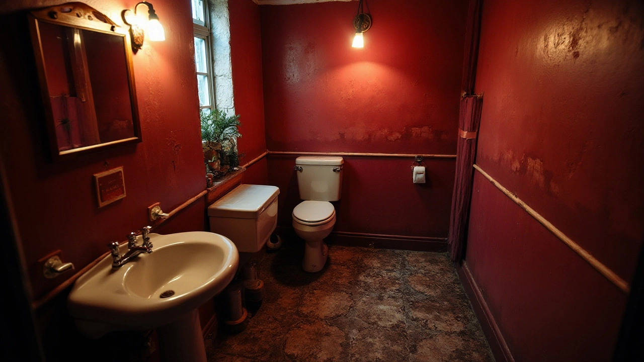
Conversely, darker colors can envelop a space, making it feel smaller and sometimes oppressive. Black and dark greys, although elegant, can be overwhelming if not balanced correctly with lighter tones or adequate lighting. Overuse of such colors may lead to a gloomy atmosphere that isn't typically desired in a bathroom. If you must go dark, consider accent walls or dark accessories to add sophistication without overwhelming the senses.
Bold colors like reds and bright yellows can make a lively statement but might not be conducive to the serene escape most seek in bathrooms. Such tones can increase energy levels, which may not be the best choice in a space meant for unwinding. According to interior design expert, Jason Grant, "Bright hues can be fun, but moderation is key in areas intended for rest and relaxation."
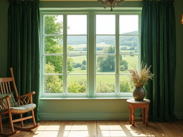
Additionally, greens, associated with nature, can convey harmony and balance when used in softer shades. Mint or sage tones, for instance, can evoke the freshness of the outdoors, especially when paired with natural materials like wood or stone. This reflection of nature can add a refreshing vibe to a bathroom, fostering a sense of rejuvenation.
An interesting aspect of color use in bathrooms is supported by data from a Home Improvement survey, noting that 62% of homeowners experienced increased satisfaction in their living spaces when incorporating nature-inspired palettes. This emphasizes the power of color in enhancing overall well-being. Selecting the right colors for your bathroom decor is more than mere aesthetics; it intricately connects to how we feel and operate within our personal spaces.
The Dangers of Dark Colors
Color choice in bathroom spaces isn't just a matter of taste; it significantly influences how the environment feels. Dark colors may seem elegant and bold, but they often have unintended effects that make them impractical for bathrooms. One of the primary issues with darker hues is how they absorb light, making spaces appear smaller and gloomier. In bathrooms, where natural light is often limited, this can create a cramped and somewhat oppressive atmosphere.
Additionally, dark colors, while rich and captivating, tend to show water spots and soap scum more visibly than lighter shades. If you're someone who values a pristine environment, regularly maintaining such colors may become a perpetual task. Benjamin Moore color expert Andrea Magno points out, "Dark colors, although trendy, can transform a vibrant space into something quite the reverse." Though alluring, the upkeep they necessitate can dampen one's enjoyment of the bathroom.
The Impact on Mood
Beyond physical considerations, dark colors also play into the psychology of color. Shades like deep navy or charcoal grey can evoke feelings of melancholy, which is counterproductive in spaces like bathrooms where you typically start and end your day. Color psychologists often suggest avoiding such tones in smaller spaces for this reason. They can inadvertently sap energy rather than rejuvenate it, which is crucial for your morning routine.
There are practical aspects, too. Repairs and updates to fixtures, tiles, or grout are more noticeable against dark backgrounds, often requiring more frequent touch-ups. This is an important consideration for those planning long-term maintenance and cost efficiency. Estimating how much additional work and money may go into preserving the aesthetic charm of a darker bathroom is crucial. Interior design is not merely about today's choice; it's an investment in tomorrow's ease and comfort.
"Considering how much time we actually spend in our bathrooms, choosing a color that supports well-being should not be underestimated," advises Jane Greenwood, a renowned design psychologist.
Breaking the Monotony
If you're already dealing with dark tiles or existing structures and wish to soften their impact, integrating bathroom decor elements in lighter shades provides a balanced counterpoint. White towels, off-white vanity units or light-toned bathmats can help break the monotony. Using such tactics imbues the space with touches of contrast, inviting warmth and openness.
Considering every angle—from visible flaws to the potential psychological weight—they carry, dark colors are something to approach with caution in your bathroom designs. By understanding these nuances, you can make informed decisions that reflect both your style and practical concerns, ensuring your bathroom is a place of comfort rather than a constant reminder of upkeep challenges.
Why Yellow Isn't Always Friendly
Yellow, often associated with sunlight, happiness, and warmth, might seem like the perfect choice to infuse a sense of cheerfulness into your bathroom. However, its vibrancy can sometimes have surprising effects that aren't always as welcoming as you'd expect. Choosing yellow for your bathroom often leads people to assume it'll invoke a bright and lively atmosphere, but the reality can be quite different. The truth is, yellow can sometimes cast a harsh reflection, making it less flattering on the skin when you look in the mirror, which might not be the best for a space devoted to self-preparation.
Our brains can process warm colors like yellow as stimulating, but this can backfire, especially when overused in confined spaces. A deeply saturated or too-bright yellow may cause eye fatigue and even slight anxiety over time. It's crucial to consider how lighting, both artificial and natural, plays a role here—the wrong combination with yellow could have you feeling overwhelmed rather than refreshed. A respectable psychologist once shared, "While a yellow room can brighten one's mood on a gray day, the wrong shade can amplify stress."
Moreover, yellow can sometimes clash with the bathroom accessories. If you've already chosen fixtures and fittings with specific finishes or colors, it might create an unintended busy look. Think about glass shelves with silver edges or a classic white bathtub—yellow might just overwhelm their subtleness and elegance. Then there's the issue of cleanliness. On walls and floors, it highlights imperfections like scratches or water spots with glaring clarity.
For those eager to incorporate this sunny hue, moderation is key. Consider using softer tones or limiting yellow to accents through interior design elements like towels, mats, or wall art. You might also choose a lighter or pastel variant of yellow, which tends to be more soothing while still keeping the room bright. To further tone it down, pair yellow with neutral hues like grays or whites to balance out its intensity. This creates a cohesive look without losing the playful spark you intended for your space.
If you're considering a color like yellow for your bathroom, it's wise to test it out with sample swatches on different walls first. Observe how it interacts with light at various times of the day to ensure you'll love it just as much in the afternoon sun as in the morning drizzle. Planning your bathroom decor with these considerations in mind can be the difference between stepping into a space that's refreshing and pleasant, or one that feels unexpectedly jarring. Mindfulness in color selection can transform your bathroom from merely functional to a well-loved oasis.
Avoiding Overly Bold Hues
Bold hues can indeed make a statement, but in the confined quarters of a bathroom, they can easily overwhelm and create a sense of chaos rather than comfort. Bathrooms are places where we seek relaxation, a moment of peace away from the hustle, so the color choices should reflect that intention. Intense colors like bright reds, deep purples, or electric blues might seem trendy, but they can create visual tension and shrink the perceived space of an already small room.
The reason bold hues rarely work well in bathrooms is linked to how colors play with our perceptions. A small bathroom, already dealing with spatial limitations, can feel even more cramped under intense colors which absorb light rather than reflecting it. This effect is quite the opposite of what you experience with softer, more neutral tones that open up space and create a feeling of airiness.
Scientific studies have shown how colors impact our psychological well-being. For instance, red finds its way into many designs due to its ability to stimulate and increase energy levels, but it is also known for inducing feelings of tension if overused. In the context of a bathroom, this isn’t typically desirable. Aaron Christman, a renowned interior designer, once noted,
"Bold colors can be as loud as a shout. They catch the eye but don't always soothe the soul."
Instead of opting for overly bold hues, think about incorporating boldness through accents or accessories which can be changed easily. Think of wall art, luxurious towels, or a decorative shower curtain. These could introduce a pop of color without overpowering the space, offering flexibility for updates based on mood or season.
For those who simply cannot resist a bit of boldness, consider its psychologically lighter versions. A deep navy can be calming, unlike its brighter counterparts. Meanwhile, a muted mustard might offer warmth without the jarring intensity of neon yellow, striking a balance between vibrancy and comfort. Think of your bold color choice as a spice – a little goes a long way in enhancing the flavor of your bathroom's aesthetic palette.
If you'd like some concrete numbers on how color impacts perception, consider a study done by the University of Minnesota that showed participants perceived bathrooms painted in muted shades like off-white and beige as being 30% larger than those dressed in bright orange or crimson. Data such as this helps illustrate how subtle shifts in color can profoundly alter our interaction with our environment.
Subtle Alternatives for Elegance
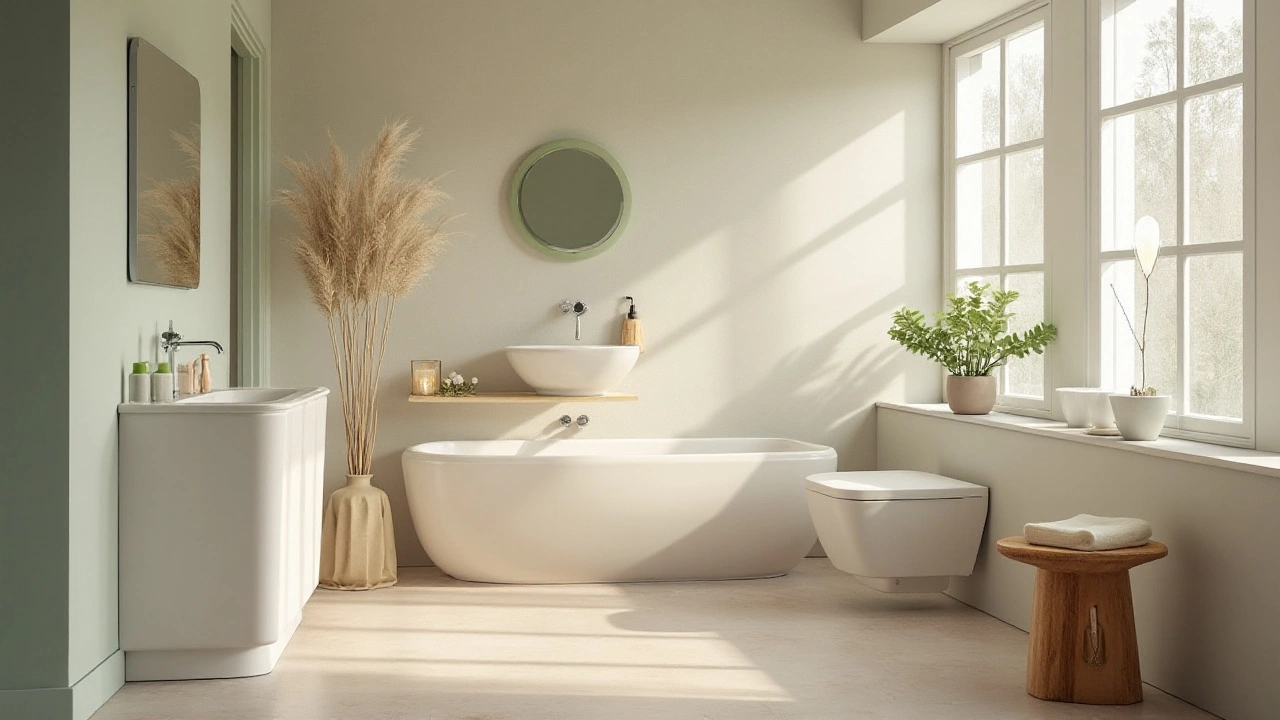
Choosing the right color for your bathroom can transform it from a mere functional space into a serene retreat. Building a refined atmosphere often starts with choosing bathroom colors that evoke calmness and balance. While bold colors may initially capture attention, the more muted and soft hues have a unique charm that offers a lasting appeal. Colors such as soft blues, gentle greys, and delicate pastels serve as excellent alternatives, harmonizing effortlessly with both traditional and modern designs. Such colors not only reflect light but create an expansive feel that makes the space feel much larger than it is. The gentle embrace of these colors brings a sense of peace, allowing the bathroom to become a genuine escape from the busy world.
Of course, the allure of a well-designed bathroom lies not just in the walls but in how these colors play off with the rest of the bathroom decor. Integrating subtle design elements, like classic white or cream-colored towels, allows for flexibility and cohesion. Watercolors like seafoam green and azure add a spa-like feel that is instantly soothing. These colors can be paired with natural elements like wood or stone to bring a touch of nature indoors, creating a more organic look and feel. Imagine a bathroom adorned with light pebble-grey tiles complemented by slatted wooden accents; this combination can instill a minimalist elegance that's both refreshing and resilient to passing trends.
Interior designers have long praised the impact of soft, neutral shades in small spaces like bathrooms. A quote from renowned interior designer Sarah Richardson encapsulates it well:
"The elegance of muted tones is that they allow for personalization and versatility, easily adapting to changing tastes yet demanding attention through their understated sophistication."These adaptable colors provide a canvas for seasonal decor changes or adding personal touches, such as cherished artwork or selected seasonal botanicals. They offer the versatility to mix and match various textile patterns, metallic accessories, or glass elements for an extra touch of luxury or personalization. Below is a quick list of optimal colors:
- Seafoam green
- Soft grey
- Powder blue
- Warm beige
- Creamy white
Statistics suggest that neutral-colored bathrooms are consistently preferred in home sales, not only for their timeless look but also for their neutral fundraising ability in resale value. Prospective buyers are often drawn to homes where bathrooms present a blank slate ready for their personal touches. When done right, these understated tones can increase a home's value by as much as 2-5%. Investing in neutral and subtle color palettes can yield substantial returns, proving that simplicity truly has the power to captivate through elegance.
Choosing the Right Accessories
When it comes to bathroom decor, the accessories you select can truly transform the space, making it not only functional but also a reflection of your personal style. To achieve the perfect balance, it is essential to pay attention to the details without becoming overwhelmed by the myriad of options available. Choosing the right accessories means understanding the interplay between color, material, and the functionality of the items you introduce.
One key factor is consistency in color. Opt for accessories that complement, rather than clash with, your existing bathroom palette. If your walls boast a neutral tone, bold accessories can create delightful pops of color. On the flip side, if your bathroom is already colorful, choose accessories in more muted hues to maintain harmony. Quality doesn’t have to break the bank. Even budget-friendly items can elevate a space when chosen thoughtfully and styled well. Alexis Lober, an established interior designer, once mentioned, "The bathroom is an intimate space where every detail counts, from the soap dish to the towel rack."
Material choice is no less important. While plastic may seem like a practical choice, it can often look cheap and wear out quickly. Instead, consider investing in ceramic, glass, or stainless-steel pieces. Not only do these materials carry an upscale appearance, but they are also durable over the long-term. Replacing the usual with the unexpected, like a vintage glass jar for storing cotton balls, can bring character to the space. Avoid overcrowding the bathroom with too many items. Stick to essentials and find decorative pieces that also serve a purpose, like an elegant mirror or an ornamental toothbrush holder.
Lighting should also be considered an accessory in itself. The right lighting can change the perception of colors in a space and set the mood. Opt for lighting fixtures that provide sufficient illumination while complementing the overall design. For instance, warm lights can make a bathroom feel cozy, while brighter, white light adds a modern touch. Another oft-overlooked accessory element is plants. Introducing some greenery not only purifies the air but also adds life to the setting. Choose plants like ferns or orchids that thrive in humid conditions. If you’re concerned about maintenance, faux plants can also deliver a similar aesthetic impact without the need for care.
Storage solutions serve as functional accessories and need thoughtful consideration. Striking an aesthetic balance between functionality and style is key. Can't outsized cabinets – they may offer storage, but can overwhelm a space. Instead, incorporate floating shelves or chic wire baskets for a sleek, organized look. Lastly, intertwine your interior design theme with the season or a particular motif. This could be through the towels you hang or a small rug you place as a focal point. The bathroom, after all, is a space you start and end your day in. It should invoke joy, tranquility, or even a sense of invigorating refreshment depending on what you need at the time.