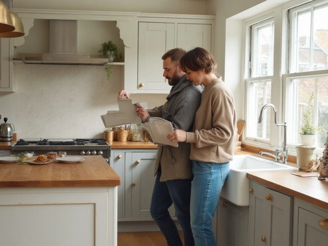
You want cabinets that won’t date your kitchen in two years or tank resale. Paint is cheaper than new joinery, sure, but repainting cabinets is still a big job. The win is choosing a color that looks fresh now and still right in ten years. No trend-chasing. No guessing. Here’s the short list that endures, plus a simple way to pick the exact shade for your light, layout, and finishes.
- timeless kitchen cabinet colors shortlist: warm or neutral whites, soft grey/greige, navy, black, and light-to-medium natural wood.
- Why they last: they play well with most benchtops, metals, and flooring; they flatter many styles; they survive trend cycles.
- Fast fit rule: small or dim kitchen → lighter cabinets; big, bright kitchen → you can go darker.
- Test on A4 boards in your actual light. Pick sheen for wipeability (satin or semi-gloss), not for shine alone.
- Pair with timeless partners: restrained stone (real or engineered), simple splashbacks, classic metals (brass, chrome, black).
- What you’re here to do: get a tight, safe color shortlist; choose the right undertone; match with your benchtop and floor; avoid trends that age fast; and set a finish that’s easy to clean.
The Evergreen Palette: What Not to Regret in 10+ Years
I live in Auckland, where the light is bright, the humidity is real, and kitchens work hard. The colors below keep coming out on top in client projects and in the data. The National Kitchen & Bath Association’s 2024 Design Trends Report shows whites and wood tones leading now and into 2026, with navy and black as steady classics. Houzz’s recent kitchen studies echo that: white remains No. 1, soft greys/greiges close behind, and natural wood coming back strong for warmth.
Here’s what lasts and why.
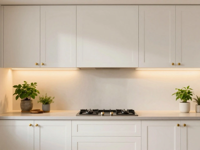
1) Warm or Neutral Whites
- Why they endure: They bounce light, make small kitchens feel bigger, and fit almost any style-from villa shaker to sleek new build. They also pair with every benchtop and metal finish.
- Undertones: Avoid stark blue-white in strong New Zealand light; it can look clinical. A warm or soft-neutral white plays nicer with rimu floors and creamier stones.
- Good starting points (test first): Resene Alabaster, Resene Black White (Half), Resene Sea Fog; Dulux Half White Pointer, Dulux Okarito (Quarter). These are common here and easy to match with trims.
- Pairs with: Timber floors, white or light stone, brushed or polished chrome, aged brass, matte black hardware. You can add color with stools, art, or a patterned runner.
- Style fit: Everything. Shaker, coastal, modern, farmhouse, Japandi.
- Watch-outs: Too-cool whites can go icy; too-creamy whites can look yellow if your benchtop is crisp white quartz. Always sample next to your benchtop slab.
2) Soft Grey and Greige (Grey-Beige)
- Why they endure: Softer greys feel calm and tailored, and greiges bridge warm/cool materials. They hide smudges better than pure white.
- Undertones: Watch violet or green cast. In southern hemisphere rooms, cool light can exaggerate blue/violet undertones in grey-sample carefully.
- Starting points: Resene Half Foggy Grey, Resene Double Sea Fog, Dulux Tranquil Retreat (Half). For greige, try Resene Quarter Ash or Dulux Hog Bristle (Quarter) if you like warmer.
- Pairs with: Warm oak floors, marble-look quartz, nickel or brass hardware, soft white walls.
- Style fit: Transitional, modern, Scandinavian, contemporary classic.
- Watch-outs: Dark cool greys can read flat or gloomy if you have low natural light. Choose mid-to-light, and add wood or brass for warmth.
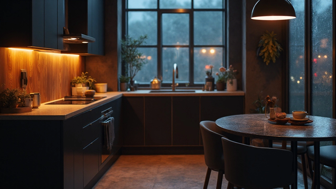
3) Navy
- Why it endures: Deep navy gives depth and polish. It’s sophisticated without being severe. A true navy is a staple in fashion and interiors for decades.
- Best use: Lowers on a two-tone kitchen, or full runs in big, bright spaces. It loves shaker doors and mixed metals.
- Undertones: Choose a navy with a near-black base or a slightly inky tone. Avoid bright royal blues for longevity.
- Pairs with: Warm brass or champagne hardware, Carrara-look stone, oak floors, crisp white walls.
- Watch-outs: Dust shows on dark glossy paint. Use satin or matte polyurethane on wood floors nearby to balance the sheen.
4) Black
- Why it endures: Black stays dramatic and architectural. It frames a space like eyeliner. It doesn’t age like green or wine reds can.
- Best use: Flat fronts in modern kitchens, or classic paneled doors with strong lighting. Great on an island-keep the perimeter light if your room is small.
- Undertones: In Kiwi daylight, a neutral black or soft charcoal is easier than a harsh jet black. Test next to your splashback to avoid mismatched blacks.
- Pairs with: White or concrete-look benchtops, timber shelves, matte black or stainless appliances.
- Watch-outs: Shows fingerprints and micro-scratches. Pick a resilient 2K polyurethane finish or high-performance enamel. Good task lighting is non-negotiable.
5) Natural Wood (Light to Medium)
- Why it endures: Timber brings warmth and age-well character you can’t fake. Light oaks and mid walnuts are especially forgiving and timeless.
- Species/stains: European oak in a natural or pale matte finish; American white oak with a clear coat; walnut with a light natural finish. Avoid orange or red-heavy stains if you want a resilient look.
- Finish: Low-sheen polyurethane or hardwax oil for a natural hand-feel. In humid kitchens (hi, Auckland), choose a sealed finish with proper edge banding.
- Pairs with: Soft whites, greige walls, stone or concrete benchtops, any metal hardware.
- Watch-outs: Veneer quality matters. Cheap veneer can chip at edges. Ask your maker about edge protection and moisture resistance.
What I skip for “never out of style” cabinets: sage or forest green, terracotta, bright blues, and saturated trend tones. They can look amazing today but swing with fashion fast. If you love color, use it on a pantry door, island back panel, or bar hutch you’re happy to repaint later.
| Color | Best For | Pros | Watch-outs |
|---|---|---|---|
| Warm/Neutral White | Small or dark kitchens, any style | Bright, resale-friendly, flexible | Undertone clashes with benchtops |
| Soft Grey/Greige | Modern to transitional | Hides smudges, calm vibe | Cool greys can feel cold |
| Navy | Islands, big bright rooms | Elegant, rich contrast | Shows dust on gloss, lighting needed |
| Black | Modern, high-contrast schemes | Bold, architectural | Fingerprints/scratches visible |
| Natural Wood | Warmth, texture | Timeless, tactile | Veneer quality, moisture care |
Credibility check: NKBA 2024 highlights white and wood as long-term leaders, with darker blues and blacks used as accents or lower cabinets. Paint manufacturers and Master Painters NZ recommend durable enamel or 2K polyurethane for kitchen cabinetry for wipeability and resistance to moisture and oils. Resene and Dulux both publish LRV (light reflectance value) on swatches-handy when you’re weighing how “light” a color really is in your space.
A Simple Plan to Pick Your Forever Shade
Use this step-by-step and you won’t second-guess later.
- Start with your constraints. What’s not changing? Benchtop, flooring, appliances, splashback, wall color. Your cabinet color has to serve those. Snap photos in daylight and note undertones: is your benchtop warm (cream/gold veining) or cool (blue/grey veining)? Are your floors orange-leaning rimu, yellow pine, cool oak, or dark brown?
- Pick your direction with LRV. LRV is light reflectance value (0 = black, 100 = pure white). In small or dim kitchens, aim LRV 70-90 (off-whites). In medium light, you can do LRV 50-70 (light grey/greige, pale wood). In big, bright rooms, go as low as LRV 5-20 (navy/black) without feeling heavy.
- Set your undertone.
- Warm floors/benchtops → warm white or greige.
- Cool stone/steel-heavy look → neutral white or soft grey.
- Mixed materials → greige bridges them best.
- Choose the finish (sheen) for cleaning first. Satin or semi-gloss on painted cabinets cleans up easier than matte. On wood, a low-sheen polyurethane feels modern but still wipes down. High-gloss shows every fingerprint unless you’re perfect with cleaning.
- Sample like a pro. Get test pots of 2-3 contenders. Paint two coats on A4 card or foam boards. Test vertically beside your benchtop and splashback in morning, midday, and night light. In Auckland’s strong daylight, cool whites go icier, warm whites go creamier-judge in your actual light.
- Check metals and appliances. Hold your hardware samples (brass, chrome, black) against the painted boards. Some whites make brass go too yellow; some greys dull chrome. Stainless appliances can read blue; make sure your grey doesn’t go purple next to them.
- Decide on one story. If your benchtop has strong pattern, keep cabinets calm. If your cabinets are dark and bold, choose a quieter splashback. One hero, not three.
- Confirm with a door sample. If possible, paint or order one actual cabinet door in the final color and sheen. The profile and sheen change the read versus a flat board.
Hardware pairing cheatsheet:
- Warm whites/greige → aged brass, brushed brass, or matte black.
- Soft grey → brushed nickel, stainless, or black.
- Navy → unlacquered brass for warmth; chrome for a crisp nautical vibe.
- Black → brass for luxe, black-on-black for minimal, stainless for industrial.
- Natural wood → almost anything; pick the metal that echoes your lighting or tapware.
Benchtop pairing rules of thumb:
- White/soft grey cabinets → marble-look quartz, light concrete, or pale engineered stone.
- Navy/black cabinets → white or very light stone, or light timber tops if sealed well.
- Natural wood cabinets → stone that’s quieter and lighter, or crisp white to avoid too-much-brown.
Small kitchens (apartments, galley): Keep cabinets light (LRV 70+), or do light uppers with a slightly deeper lower. Use minimal contrast between cabinet color, walls, and splashback to make the room read bigger.
Large kitchens: You can lean darker or two-tone. Do navy/black lowers or island with white or greige uppers. Make sure you have good natural light or layered lighting: ceilings (ambient), task (under-cabinet/pendants), and accent.
Humidity and durability (NZ reality): Choose a moisture-resistant substrate (MR MDF) and a durable finish. Two-pack polyurethane or a high-performance waterborne enamel holds up to steam and wiping. BRANZ guidance on ventilation is clear: use a ducted rangehood to control moisture so finishes last. Wipe splashes quickly and avoid harsh abrasives.
Notes on styles:
- Shaker doors love white, greige, navy, and black. Timeless as long as rails/stiles are not overly fussy.
- Flat fronts love black, grey, and wood in low-sheen finishes for a modern look.
- Heritage homes: warm white or natural wood feels right with period trim. Keep profiles modest to avoid a theme-park vibe.
Personal tip from my own Auckland bungalow: We tested Resene Sea Fog and Dulux Half White Pointer on A4 boards for a week. Sea Fog read calmer next to our slightly warm quartz and rimu floors, so we ran that on the perimeter and used a walnut veneer island for warmth. Zero regrets, easy to clean, and it’s not yelling a specific year.
Pairings, Checklists, FAQ, and Next Steps
Example timeless palettes (swap brands if you prefer; test first):
- Bright, compact kitchen: Cabinets Resene Alabaster; Walls Resene Quarter Black White; Benchtop light marble-look quartz; Hardware brushed nickel; Floors natural oak.
- Warm modern classic: Cabinets greige (Resene Quarter Ash); Island walnut veneer; Walls soft white; Benchtop Taj Mahal quartzite look; Hardware aged brass; Splashback simple white subway with soft grey grout.
- Navy moment: Lowers deep navy (custom mix leaning inky); Uppers warm white; Benchtop crisp white; Hardware unlacquered brass; Floors mid oak; Tapware brushed brass.
- Black and white: Lowers neutral black (soft charcoal); Uppers neutral white; Benchtop white with subtle grey veining; Hardware matte black; Splashback white zellige.
- All-wood warmth: European oak veneer in a natural matte; Walls soft white; Benchtop quiet light stone; Hardware black; Splashback handmade off-white tile.
Timeless decision checklist:
- Have I chosen one hero (color OR stone OR tile), not all three?
- Does my cabinet color suit the undertone of my benchtop and floor?
- Is the LRV appropriate for my room size and light?
- Have I tested samples on large boards in my light, next to real materials?
- Did I confirm sheen for easy cleaning (satin or semi-gloss on paint; low-sheen poly on wood)?
- Do my hardware and tapware metals play nicely with the cabinet undertone?
- Is my ventilation sorted (ducted rangehood) to protect finishes?
Common pitfalls to avoid:
- Picking stark “ceiling white” for cabinets-it can look blue and clinical.
- Choosing a cool grey next to warm benchtops-clash city.
- High-gloss dark paint if fingerprints will drive you mad.
- Ignoring the floor undertone-your biggest color surface sets the mood.
- Copying a photo without checking how your southern hemisphere light shifts it.
Mini-FAQ
- Are white cabinets going out of style in 2025? No. NKBA’s 2024 report and current showroom launches still show white as a long-term leader. The trick is a soft, warm or neutral white-too stark is less friendly.
- Greige vs grey-what’s safer? Greige. It bridges warm and cool materials, so it survives more renovations and resale scenarios.
- Is navy a fad? True navy has been around for decades. Electric or bright blues feel trendier and age faster.
- Black-too harsh? Not if you balance it with light benchtops, good lighting, and texture (timber, soft textiles).
- Matte, satin, or gloss? Satin or semi-gloss on painted cabinets for wipeability. Matte on wood can look premium but needs a durable sealer.
- Two-tone-still OK? Yes, when it’s restrained. Dark lowers + light uppers or a dark island with light perimeter stay classic.
- What about green? Soft grey-greens can be lovely but are more trend-sensitive. If you crave it, try it on an island or pantry only.
Quick pairing matrix (keep it simple):
| Cabinet | Benchtop | Splashback | Hardware |
|---|---|---|---|
| Warm White | Light marble-look quartz | White subway or handmade off-white | Brass or black |
| Soft Greige | Quiet warm stone | Gloss white or pale taupe | Nickel or brass |
| Navy | Crisp white stone | White or pale grey | Brass |
| Black | White or light concrete-look | White or light timber | Black or stainless |
| Natural Wood | Light neutral stone | Off-white or pale greige | Black or brass |
Care and cleaning basics:
- Daily: Microfibre cloth and mild soapy water. Dry after.
- Grease zones: Degreaser made for painted cabinets; avoid abrasives.
- Hinges: Tighten and adjust once a year; soft-close saves wear.
- Edges: Wipe spills quickly, especially on veneered edges.
Next steps / Troubleshooting
- Budget reno, existing benchtop stays: Pull a warm neutral white or greige that flatters the benchtop undertone. Replace just hardware and splashback for the biggest lift per dollar.
- Dark, small kitchen: Choose an off-white (LRV 80+), minimal contrast, integrated handles or slim bars, glossy splashback to bounce light.
- Family with kids: Mid-tone greige or natural wood hides smudges best. Satin sheen. Full-height splashback behind cooktop.
- Heritage villa: Warm white or natural wood; classic shaker or bead detail, unlacquered brass that patinas. Keep appliances simple.
- Modern apartment: Soft grey or black lowers with white uppers. Finger-pull or slim matte black hardware. Concrete-look benchtop for texture.
- Still torn between two colors? Paint one full door of each and live with them for a week. Decide after you’ve cooked a few meals and seen morning/evening light.
- Worried about resale? Real estate agents here keep telling me the easiest sell is warm white or soft greige with simple stone and brass or black accents. Safe and broad appeal.
If you only remember three things: pick from the evergreen set (soft whites, greige/grey, navy, black, natural wood), test big samples in your real light, and choose sheen for cleaning. That’s how you get a kitchen that feels right today and still right when you’ve forgotten what year you painted it.