Ever walked into a bathroom and instantly thought, "Wow, this feels fancy!" but couldn't quite figure out why? It's not always about marble counters or gold fixtures. Color—simple paint, tiles, or even towels—can totally change how rich a space feels. Turns out, you don't need a designer's budget to pull off that five-star hotel vibe. Just know the right shades that create an expensive atmosphere, and suddenly your basic bathroom could look like it's straight out of an interior magazine.
Why Color Matters So Much in Bathroom Design
If you’re picturing a high-end bathroom, you probably see calm, clean spaces, not chaos. There’s real science to that. Designers swear by the psychology of color, especially in small rooms like bathrooms. Certain shades reflect more light, open up a cramped layout, or bring a sense of spa-like calm. Others can highlight cheap tiles, make water spots more obvious, or feel outdated fast. When you get the color right, every other element – even the cheaper stuff – suddenly looks more expensive.
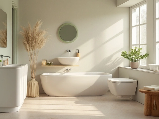
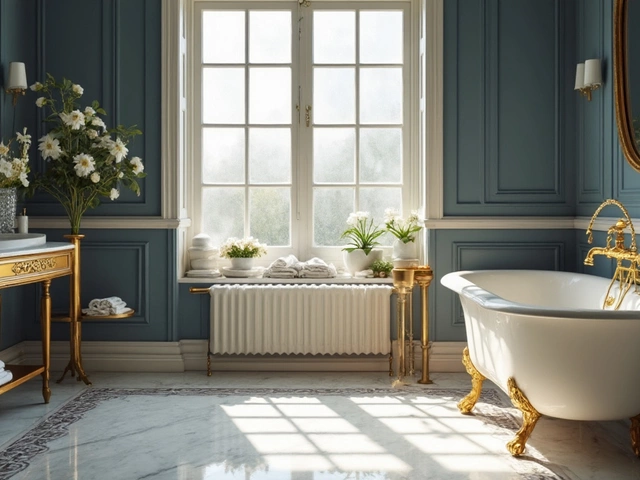
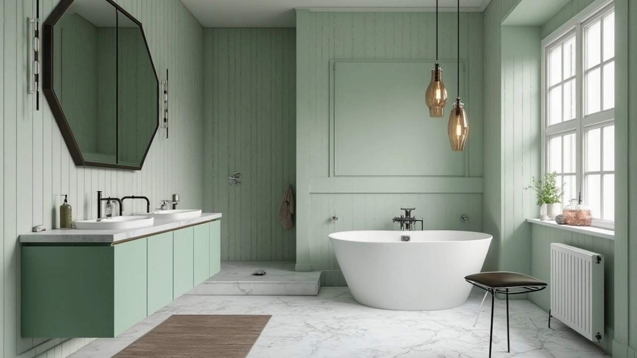
So, what actually happens when you choose the perfect color? For starters, light and neutral shades make a room feel bigger. Hotels know this trick well; they often use a lot of white, cream, and pale gray, because these hues bounce light around and hide imperfections. Going for a deep navy or a moody forest green? Those colors add instant drama, making the bathroom feel like a luxurious retreat (especially paired with gold or brass taps). But that doesn’t mean you can just slap any shade on the wall. Some colors look great in theory but ugly with that teal bathtub or off-white tile. Context always matters.
One bold fact: A 2023 UK study found that homes with pale blue or dove gray bathrooms sold faster and for higher prices compared to those with bold oranges or reds. Buyers felt the lighter colors were "clean, calming, and tidy." Not to mention, soft-toned walls provide a perfect background for adding metallics, glass, or dark wood accents, which the eye reads as both modern and expensive.
Big mistake people make? They ignore undertones. Whites and grays especially can have blue, yellow, or pink undertones that totally change the feel of the space. If the rest of your fixtures are warm (think brown, beige, brass), picking a stark blue-white can clash and make everything look dingy. Stick with a warm white or soft greige (that perfect balance between gray and beige). On the flip side, with cool chrome and lots of glass, a crisp blue-gray looks clean and modern.
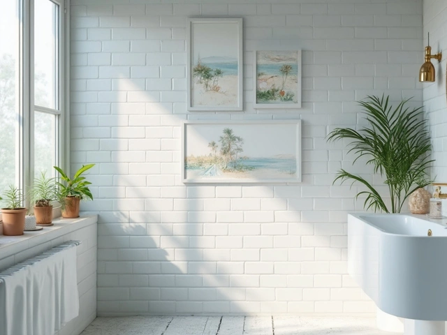
It doesn’t stop with paint. Tiles, floors, cabinetry, and even towels contribute to the color scheme. That’s why so many "luxury bathroom" photos you see online don’t use more than three colors overall—often, it’s two neutrals and one accent color in accessories.
Texture and finish matter too. Glossy paint reflects lots of light and looks polished, but can show every drip or fingerprint. Matte finishes feel softer and mask small imperfections. Many designers in Auckland love semi-gloss for walls and satin for cabinetry—striking the right balance between style and practicality, especially in a humid climate like ours.
Timeless Colors That Instantly Look Expensive
If you secretly check out Instagram homes and think, “How do they pull this off?” the answer is, nine times out of ten, it’s smart, classic color choices—not wild trends. Ready for the most tried-and-true shades that designers say scream luxury?
- Bathroom colors in soft whites are always number one. Think Benjamin Moore "Chantilly Lace" or Dulux’s "Natural White." Pick a white that feels warm or clean against all your hard surfaces. Warm whites work best with cream tiles and gold fixtures, while cooler whites look great with silver and marble.
- Light gray brings subtle sophistication and suits pretty much every style. Choose a shade like Resene "Sea Fog" or "Double Black White" for timeless calm. It’s a safe pick if you rent, since it isn’t likely to date fast.
- Fancy hotels love navy blue for a reason—it’s bold without being loud. Try it on a feature wall, vanity, or even cabinetry. Pair with pale walls and white marble for serious impact. Dulux’s "Blue Rhapsody" is lush and deep, while Resene’s "Bunting" has just enough darkness to add drama.
- Greige—yep, that word again. Somewhere between gray and beige, this shade adds a designer touch without being boring. Check out "Quarter White Pointer" by Resene for a hint of warmth that goes with everything.
- If you’re scared of going too dark, try a charcoal or graphite accent. It’s perfect for tiles or cabinets. Paired with gold or black hardware, it instantly feels more expensive.
- Blush pink, used sparingly, can soften the harshness of white or gray. Look for muted, almost neutral pinks—not Barbie pink. They look beautiful in tiles or towels, especially with warm metals.
- Rich jewel tones like emerald or deep teal work in larger bathrooms or powder rooms with good light. Don’t paint every wall; instead, use them as a pop on cabinetry or half-walls.
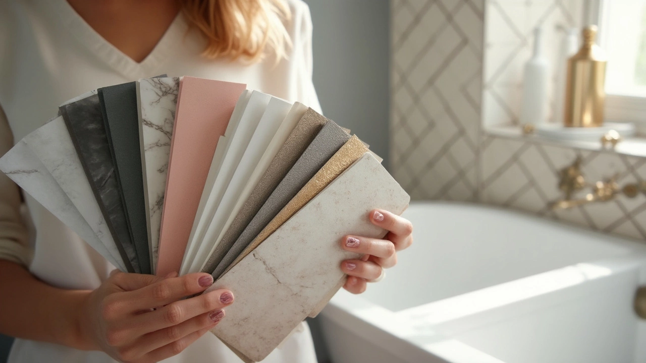
Think of color like makeup for your bathroom—you want it to enhance, not overwhelm. That’s why designer bathrooms almost always stick to subtle, natural shades that won’t feel dated next year. If in doubt, grab a few paint swatches, try them next to your tiles, and see which undertones jump out.
Want your bathroom to look even more expensive? Stick to one main color and two supporting shades. Use the main color on your walls and biggest surfaces, a second for accents, and the third for decorative extras like towels, vases, or art. Don’t go overboard—let your materials (tile, stone, or wood) shine. And if you’re adding a bold color, keep it below eye level: vanities or lower tiles. This helps maintain a sense of calm and openness at eye level, which feels less cluttered.
Fact bomb: Auckland's top interior designers revealed in a 2024 survey that 64% of new luxury bathrooms use a palette of soft whites, muted blues, or greige. Why? They make bathrooms look clean, timeless, and premium—no matter the budget.
Tips for Boosting Expensive Vibes Through Color
Want some trade secrets? It’s not just about the paint. Accessories, lighting, and texture all play a role in pulling off that luxury look. First, get the lighting right. Warm LED bulbs (not harsh blue light) make whites and creams appear richer and more flattering. If your bathroom lacks natural light, choose the brightest white you can live with to keep things airy.
Go monochrome, but layer in different textures. If you pick gray, don’t stop at gray walls—try a slightly darker gray cabinet, a stone-look tile, and gray towels or bathmats. Mixing materials with similar tones gives a sense of intentional design, which always looks more expensive than a mix of random colors. Pattern matters, too. Use patterned tiles sparingly: a feature wall or a shower nook is usually enough. Overdoing it makes the space feel busy, not luxe.
Metal accents lift any bathroom. Gold and black are the go-to choices lately. They pop against most luxury shades and give instant boutique hotel style. Swapping out handles and taps for something sleek in matte black or brushed gold can transform even a bargain flat-pack unit.
If you crave color but hate risk, start small. Pick a bold shade for towels, art, or a bathmat. They’re easy and cheap to swap out if you get bored or trends change. For a bold, lush look, mix dark green or sapphire blue with crisp white for contrast. This combo looks amazing with plants—think a trailing pothos hung from the ceiling or some leafy monsteras on a shelf. Greenery pops against cool tone walls and adds a fresh, expensive energy.
Don’t forget the ceiling. Painting the ceiling the same color as your walls (especially in smaller bathrooms) blurs lines and makes the room feel bigger—an old designer trick Auckland stylists use in modern apartments. For tiny bathrooms, high-gloss white paint reflects more light and looks like polished stone.
Another clever touch: use one color but in multiple finishes. Matte on the walls, eggshell on trim, semi-gloss for cabinetry. It keeps the palette cohesive but adds layer and depth. And always, always test in your bathroom’s real light, not just at the paint shop. The way daylight streams in at 7 a.m. is way different than how the room glows at night.
Tile grout can also make or break the look. Dark grout with light tiles is trendy, but it might clash with an expensive aesthetic unless balanced just right. Designers usually opt for grout colors that match or are just a touch lighter/darker than the tile for a seamless, custom feel.
Want to boost that high-end energy with almost no spend? Swap out a tired shower curtain for a crisp white (or soft gray) linen one. Choose fluffy white towels, and add a wooden stool or bamboo tray near the tub. Even a simple touch like decanting your shampoo into matching glass bottles gives that minimal, spa-like vibe that feels expensive, though it costs nearly nothing.
To sum up these tips: keep the color palette restrained, go for luxe accessories and metals, pay attention to undertones and lighting, and mix subtle tones and textures. Play it safe with neutrals, or make a statement with deep blues or greens—just keep every finish and accessory purposeful. With these moves, your bathroom can feel seriously upscale, no matter the size or budget.